Redoc logo # Generate interactive API documentation from OpenAPI definitions [![Coverage Status](https://coveralls.io/repos/Redocly/redoc/badge.svg?branch=main&service=github)](https://coveralls.io/github/Redocly/redoc?branch=main) [![npm](http://img.shields.io/npm/v/redoc.svg)](https://www.npmjs.com/package/redoc) [![License](https://img.shields.io/npm/l/redoc.svg)](https://github.com/Redocly/redoc/blob/main/LICENSE) [![bundle size](http://img.badgesize.io/https://cdn.redoc.ly/redoc/latest/bundles/redoc.standalone.js?compression=gzip&max=300000)](https://cdn.redoc.ly/redoc/latest/bundles/redoc.standalone.js) [![npm](https://img.shields.io/npm/dm/redoc.svg)](https://www.npmjs.com/package/redoc) [![](https://data.jsdelivr.com/v1/package/npm/redoc/badge)](https://www.jsdelivr.com/package/npm/redoc) [![Docker Build Status](https://img.shields.io/docker/build/redocly/redoc.svg)](https://hub.docker.com/r/redocly/redoc/)
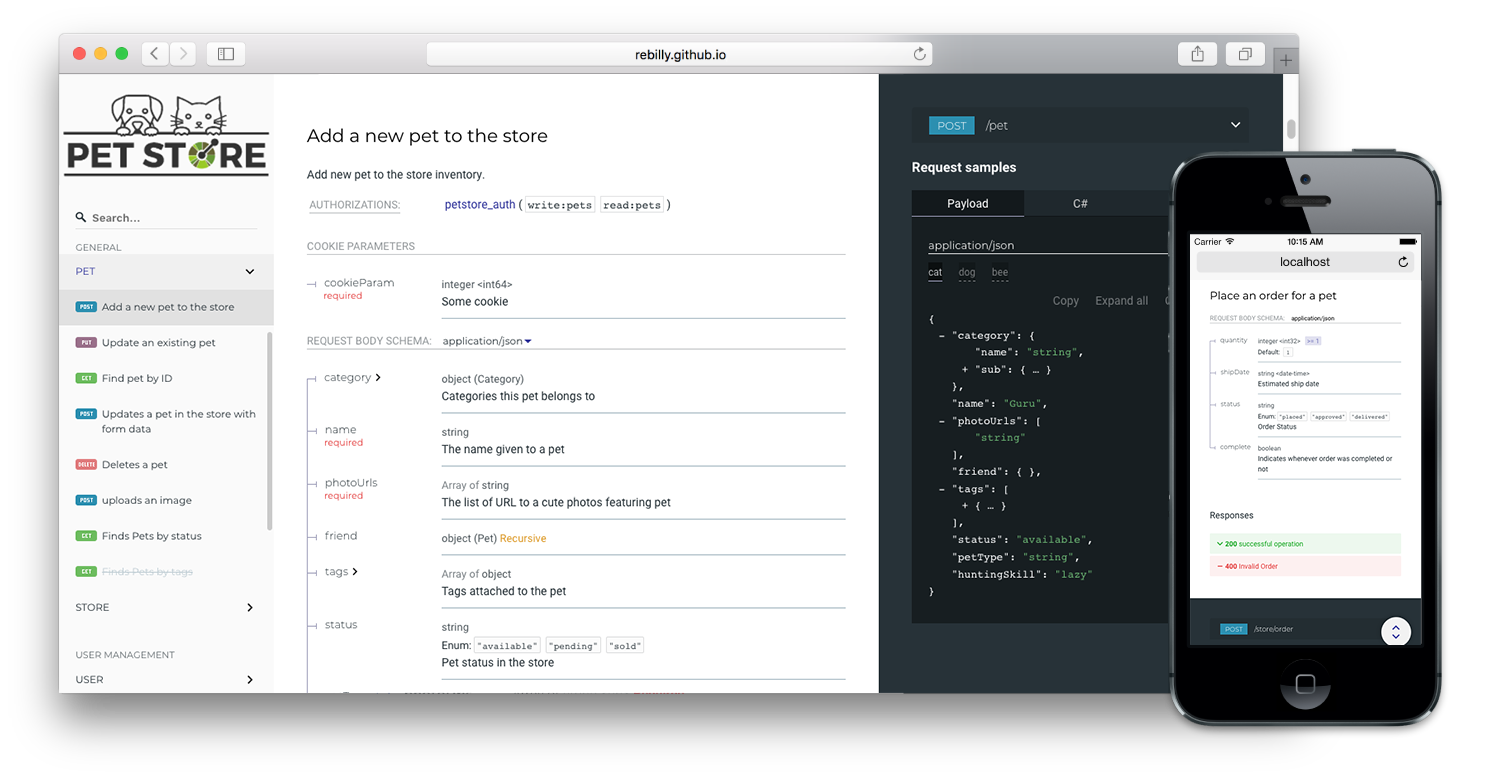
**This is the README for the `2.x` version of Redoc (React-based).** **The README for the `1.x` version is on the [v1.x](https://github.com/Redocly/redoc/tree/v1.x) branch.** ## About Redoc Redoc is an open-source tool for generating documentation from OpenAPI (fka Swagger) definitions. By default Redoc offers a three-panel, responsive layout: - The left panel contains a search bar and navigation menu. - The central panel contains the documentation. - The right panel contains request and response examples. ![Redoc demo](https://raw.githubusercontent.com/Redocly/redoc/main/demo/redoc-demo.png) ## Live demo If you want to see how Redoc renders your OpenAPI definition, you can try it out online at https://redocly.github.io/redoc/. A version of the Swagger Petstore API is displayed by default. To test it with your own OpenAPI definition, enter the URL for your definition and select **TRY IT**. ## Redoc vs. Reference vs. Portals Redoc is Redocly's community-edition product. Looking for something more? Checkout the following feature comparison of Redocly's premium products versus Redoc: | Features | Redoc | Reference | Portals | |------------------------------|:---------:|:---------:|:-----------:| | **Specs** | | | | | Swagger 2.0 | √ | √ | √ | | OpenAPI 3.0 | √ | √ | √ | | OpenAPI 3.1 | √ (basic) | √ | √ | | | | | | | **Theming** | | | | | Fonts/colors | √ | √ | √ | | Extra theme options | | √ | √ | | | | | | | **Performance** | | | | | Pagination | | √ | √ | | Search (enhanced) | | √ | √ | | Search (server-side) | | | √ | | | | | | | **Multiple APIs** | | | | | Multiple versions | | √ | √ | | Multiple APIs | | | √ | | API catalog | | | √ | | | | | | | **Additional features** | | | | | Try-it console | | √ | √ | | Automated code samples | | √ | √ | | Deep links | | √ | √ | | More SEO control | | | √ | | Contextual docs | | | √ | | Landing pages | | | √ | | React hooks for more control | | | √ | | Personalization | | | √ | | Analytics integrations | | | √ | | Feedback | | | Coming Soon | Refer to the Redocly's documentation for more information on these products: - [Portals](https://redocly.com/docs/developer-portal/introduction/) - [Reference](https://redocly.com/docs/api-reference-docs/getting-started/) - [Redoc](https://redocly.com/docs/redoc/quickstart/intro/) ## Features - Responsive three-panel design with menu/scrolling synchronization - [Multiple deployment options](https://redocly.com/docs/redoc/quickstart/intro/) - [Server-side rendering (SSR) ready](https://redocly.com/docs/redoc/quickstart/cli/#redoc-cli-commands) - Ability to integrate your API introduction into the side menu - [Simple integration with `create-react-app`](https://redocly.com/docs/redoc/quickstart/react/) [Example repo](https://github.com/APIs-guru/create-react-app-redoc) - [Command-line interface to bundle your docs into a **zero-dependency** HTML file](https://redocly.com/docs/cli/commands/build-docs/) - Neat **interactive** documentation for nested objects
![](docs/images/nested-demo.gif) ## Customization options [Customization services](https://redocly.com/#services) - High-level grouping in side-menu with the [`x-tagGroups`](https://redocly.com/docs/api-reference-docs/specification-extensions/x-tag-groups/) specification extension - Branding/customizations using the [`theme` option](https://redocly.com/docs/api-reference-docs/configuration/theming/) ## Support - OpenAPI v3.0 support - Basic OpenAPI v3.1 support - Broad OpenAPI v2.0 feature support (yes, it supports even `discriminator`)
![](docs/images/discriminator-demo.gif) - Code samples support (via vendor extension)
![](docs/images/code-samples-demo.gif) ## Releases **Important:** all the 2.x releases are deployed to npm and can be used with Redocly-cdn: - particular release, for example, `v2.0.0`: https://cdn.redoc.ly/redoc/v2.0.0/bundles/redoc.standalone.js - `latest` release: https://cdn.redoc.ly/redoc/latest/bundles/redoc.standalone.js Additionally, all the 1.x releases are hosted on our GitHub Pages-based CDN **(deprecated)**: - particular release, for example `v1.2.0`: https://rebilly.github.io/ReDoc/releases/v1.2.0/redoc.min.js - `v1.x.x` release: https://rebilly.github.io/ReDoc/releases/v1.x.x/redoc.min.js - `latest` release: https://rebilly.github.io/ReDoc/releases/latest/redoc.min.js - points to latest 1.x.x release since 2.x releases are not hosted on this CDN but on unpkg. ## Version Guidance | Redoc Release | OpenAPI Specification | |:--------------|:----------------------| | 2.0.0-alpha.54| 3.1, 3.0.x, 2.0 | | 2.0.0-alpha.x | 3.0, 2.0 | | 1.19.x | 2.0 | | 1.18.x | 2.0 | | 1.17.x | 2.0 | ## Showcase - [Rebilly](https://api-reference.rebilly.com/) - [Docker Engine](https://docs.docker.com/engine/api/v1.25/) - [Zuora](https://www.zuora.com/developer/api-reference/) - [Discourse](http://docs.discourse.org) - [Commbox](https://www.commbox.io/api/) - [APIs.guru](https://apis.guru/api-doc/) - [BoxKnight](https://www.docs.boxknight.com/) ## Lint OpenAPI definitions Redocly CLI is an [open source command-line tool](https://github.com/Redocly/redocly-cli) that you can use to lint your OpenAPI definition. Linting helps you to catch errors and inconsistencies in your OpenAPI definition before publishing. Learn more about [API standards and linting](https://redocly.com/docs/cli/api-standards/) in the main Redocly documentation. ## Deployment ### TL;DR final code example To render your OpenAPI definition using Redoc, use the following HTML code sample and replace the `spec-url` attribute with the url or local file address to your definition. ```html Redoc ``` For step-by-step instructions for how to get started using Redoc to render your OpenAPI definition, refer to the [**Redoc quickstart guide**](https://redocly.com/docs/redoc/quickstart/) and [**How to use the HTML element**](https://redocly.com/docs/redoc/deployment/html/). ## Configuration ### Security Definition location You can inject the Security Definitions widget into any place in your definition `description`. For more information, refer to [Security definitions injection](docs/security-definitions-injection.md). ### OpenAPI specification extensions Redoc uses the following [specification extensions](https://redocly.com/docs/api-reference-docs/spec-extensions/): * [`x-logo`](docs/redoc-vendor-extensions.md#x-logo) - is used to specify API logo * [`x-traitTag`](docs/redoc-vendor-extensions.md#x-traitTag) - useful for handling out common things like Pagination, Rate-Limits, etc * [`x-codeSamples`](docs/redoc-vendor-extensions.md#x-codeSamples) - specify operation code samples * [`x-examples`](docs/redoc-vendor-extensions.md#x-examples) - specify JSON example for requests * [`x-nullable`](docs/redoc-vendor-extensions.md#x-nullable) - mark schema param as a nullable * [`x-displayName`](docs/redoc-vendor-extensions.md#x-displayname) - specify human-friendly names for the menu categories * [`x-tagGroups`](docs/redoc-vendor-extensions.md#x-tagGroups) - group tags by categories in the side menu * [`x-servers`](docs/redoc-vendor-extensions.md#x-servers) - ability to specify different servers for API (backported from OpenAPI 3.0) * [`x-ignoredHeaderParameters`](docs/redoc-vendor-extensions.md#x-ignoredHeaderParameters) - ability to specify header parameter names to ignore * [`x-additionalPropertiesName`](docs/redoc-vendor-extensions.md#x-additionalPropertiesName) - ability to supply a descriptive name for the additional property keys * [`x-summary`](docs/redoc-vendor-extensions.md#x-summary) - For Response object, use as the response button text, with description rendered under the button * [`x-extendedDiscriminator`](docs/redoc-vendor-extensions.md#x-extendedDiscriminator) - In Schemas, uses this to solve name-clash issues with the standard discriminator * [`x-explicitMappingOnly`](docs/redoc-vendor-extensions.md#x-explicitMappingOnly) - In Schemas, display a more descriptive property name in objects with additionalProperties when viewing the property list with an object ### `` options object You can use all of the following options with the standalone version of the tag by kebab-casing them. For example, `scrollYOffset` becomes `scroll-y-offset`, and `expandResponses` becomes `expand-responses`. * `disableSearch` - disable search indexing and search box. * `minCharacterLengthToInitSearch` - set minimal characters length to init search, default `3`, minimal `1`. * `expandDefaultServerVariables` - enable expanding default server variables, default `false`. * `expandResponses` - specify which responses to expand by default by response codes. Values should be passed as comma-separated list without spaces e.g. `expandResponses="200,201"`. Special value `"all"` expands all responses by default. Be careful: this option can slow-down documentation rendering time. * `generatedPayloadSamplesMaxDepth` - set the maximum render depth for JSON payload samples (responses and request body). The default value is `10`. * `maxDisplayedEnumValues` - display only specified number of enum values. hide rest values under spoiler. * `hideDownloadButton` - do not show "Download" spec button. **THIS DOESN'T MAKE YOUR SPEC PRIVATE**, it just hides the button. * `downloadFileName` - set a custom file name for the downloaded API definition file. * `downloadDefinitionUrl` - If the 'Download' button is visible in the API reference documentation (hideDownloadButton=false), the URL configured here opens when that button is selected. Provide it as an absolute URL with the full URI scheme. * `hideHostname` - if set, the protocol and hostname is not shown in the operation definition. * `hideLoading` - do not show loading animation. Useful for small docs. * `hideFab` - do not show FAB in mobile view. Useful for implementing a custom floating action button. * `hideSchemaPattern` - if set, the pattern is not shown in the schema. * `hideSingleRequestSampleTab` - do not show the request sample tab for requests with only one sample. * `showObjectSchemaExamples` - show object schema example in the properties, default `false`. * `expandSingleSchemaField` - automatically expand single field in a schema * `schemaExpansionLevel` - specifies whether to automatically expand schemas. Special value `"all"` expands all levels. The default value is `0`. * `jsonSampleExpandLevel` - set the default expand level for JSON payload samples (responses and request body). Special value `"all"` expands all levels. The default value is `2`. * `hideSchemaTitles` - do not display schema `title` next to to the type * `simpleOneOfTypeLabel` - show only unique oneOf types in the label without titles * `sortEnumValuesAlphabetically` - set to true, sorts all enum values in all schemas alphabetically * `sortOperationsAlphabetically` - set to true, sorts operations in the navigation sidebar and in the middle panel alphabetically * `sortTagsAlphabetically` - set to true, sorts tags in the navigation sidebar and in the middle panel alphabetically * `menuToggle` - if true, clicking second time on expanded menu item collapses it, default `true`. * `nativeScrollbars` - use native scrollbar for sidemenu instead of perfect-scroll (scrolling performance optimization for big specs). * `onlyRequiredInSamples` - shows only required fields in request samples. * `pathInMiddlePanel` - show path link and HTTP verb in the middle panel instead of the right one. * `requiredPropsFirst` - show required properties first ordered in the same order as in `required` array. * `scrollYOffset` - If set, specifies a vertical scroll-offset. This is often useful when there are fixed positioned elements at the top of the page, such as navbars, headers etc; `scrollYOffset` can be specified in various ways: * **number**: A fixed number of pixels to be used as offset. * **selector**: selector of the element to be used for specifying the offset. The distance from the top of the page to the element's bottom is used as offset. * **function**: A getter function. Must return a number representing the offset (in pixels). * `showExtensions` - show vendor extensions ("x-" fields). Extensions used by Redoc are ignored. Can be boolean or an array of `string` with names of extensions to display. * `sortPropsAlphabetically` - sort properties alphabetically. * `payloadSampleIdx` - if set, payload sample is inserted at this index or last. Indexes start from 0. * `theme` - Redoc theme. For details check [theme docs](#redoc-theme-object). * `untrustedSpec` - if set, the spec is considered untrusted and all HTML/markdown is sanitized to prevent XSS. **Disabled by default** for performance reasons. **Enable this option if you work with untrusted user data!** * `nonce` - if set, the provided value is injected in every injected HTML element in the `nonce` attribute. Useful when using CSP, see https://webpack.js.org/guides/csp/. * `sideNavStyle` - can be specified in various ways: * **summary-only**: displays a summary in the sidebar navigation item. (**default**) * **path-only**: displays a path in the sidebar navigation item. * **id-only**: displays the operation id with a fallback to the path in the sidebar navigation item. * `showWebhookVerb` - when set to `true`, shows the HTTP request method for webhooks in operations and in the sidebar. ### `` theme object * `spacing` * `unit`: 5 # main spacing unit used in autocomputed theme values later * `sectionHorizontal`: 40 # Horizontal section padding. COMPUTED: spacing.unit * 8 * `sectionVertical`: 40 # Horizontal section padding. COMPUTED: spacing.unit * 8 * `breakpoints` # breakpoints for switching three/two and mobile view layouts * `small`: '50rem' * `medium`: '85rem' * `large`: '105rem' * `colors` * `tonalOffset`: 0.3 # default tonal offset used in computations * `typography` * `fontSize`: '14px' * `lineHeight`: '1.5em' * `fontWeightRegular`: '400' * `fontWeightBold`: '600' * `fontWeightLight`: '300' * `fontFamily`: 'Roboto, sans-serif' * `smoothing`: 'antialiased' * `optimizeSpeed`: true * `headings` * `fontFamily`: 'Montserrat, sans-serif' * `fontWeight`: '400' * `lineHeight`: '1.6em' * `code` # inline code styling * `fontSize`: '13px' * `fontFamily`: 'Courier, monospace' * `lineHeight`: # COMPUTED: typography.lineHeight * `fontWeight`: # COMPUTED: typography.fontWeightRegular * `color`: '#e53935' * `backgroundColor`: 'rgba(38, 50, 56, 0.05)' * `wrap`: false # whether to break word for inline blocks (otherwise they can overflow) * `links` * `color`: # COMPUTED: colors.primary.main * `visited`: # COMPUTED: typography.links.color * `hover`: # COMPUTED: lighten(0.2 typography.links.color) * `textDecoration`: 'auto' * `hoverTextDecoration`: 'auto' * `sidebar` * `width`: '260px' * `backgroundColor`: '#fafafa' * `textColor`: '#333333' * `activeTextColor`: # COMPUTED: theme.sidebar.textColor (if set by user) or theme.colors.primary.main * `groupItems` # Group headings * `activeBackgroundColor`: # COMPUTED: theme.sidebar.backgroundColor * `activeTextColor`: # COMPUTED: theme.sidebar.activeTextColor * `textTransform`: 'uppercase' * `level1Items` # Level 1 items like tags or section 1st level items * `activeBackgroundColor`: # COMPUTED: theme.sidebar.backgroundColor * `activeTextColor`: # COMPUTED: theme.sidebar.activeTextColor * `textTransform`: 'none' * `arrow` # sidebar arrow * `size`: '1.5em' * `color`: # COMPUTED: theme.sidebar.textColor * `logo` * `maxHeight`: # COMPUTED: sidebar.width * `maxWidth`: # COMPUTED: sidebar.width * `gutter`: '2px' # logo image padding * `rightPanel` * `backgroundColor`: '#263238' * `width`: '40%' * `textColor`: '#ffffff' * `servers` * `overlay` * `backgroundColor`: '#fafafa' * `textColor`: '#263238' * `url` * `backgroundColor`: '#fff' * `fab` * `backgroundColor`: '#263238' * `color`: '#ffffff' ----------- ## Development see [CONTRIBUTING.md](.github/CONTRIBUTING.md)