| .github | ||
| .husky | ||
| benchmark | ||
| cli | ||
| config | ||
| demo | ||
| docs | ||
| e2e | ||
| src | ||
| tests/e2e | ||
| typings | ||
| .dockerignore | ||
| .editorconfig | ||
| .eslintrc.js | ||
| .gitignore | ||
| .npmignore | ||
| .prettierignore | ||
| CHANGELOG.md | ||
| custom.d.ts | ||
| cypress.json | ||
| karma.conf.js | ||
| LICENSE | ||
| package-lock.json | ||
| package.json | ||
| README.md | ||
| tsconfig.json | ||
| tsconfig.lib.json | ||
| tslint.json | ||
| webpack.config.ts | ||
This is the README for the 2.x version of Redoc (React-based).
The README for the 1.x version is on the v1.x branch
About Redoc
Redoc is an open-source tool for generating documentation from OpenAPI (fka Swagger) definitions.
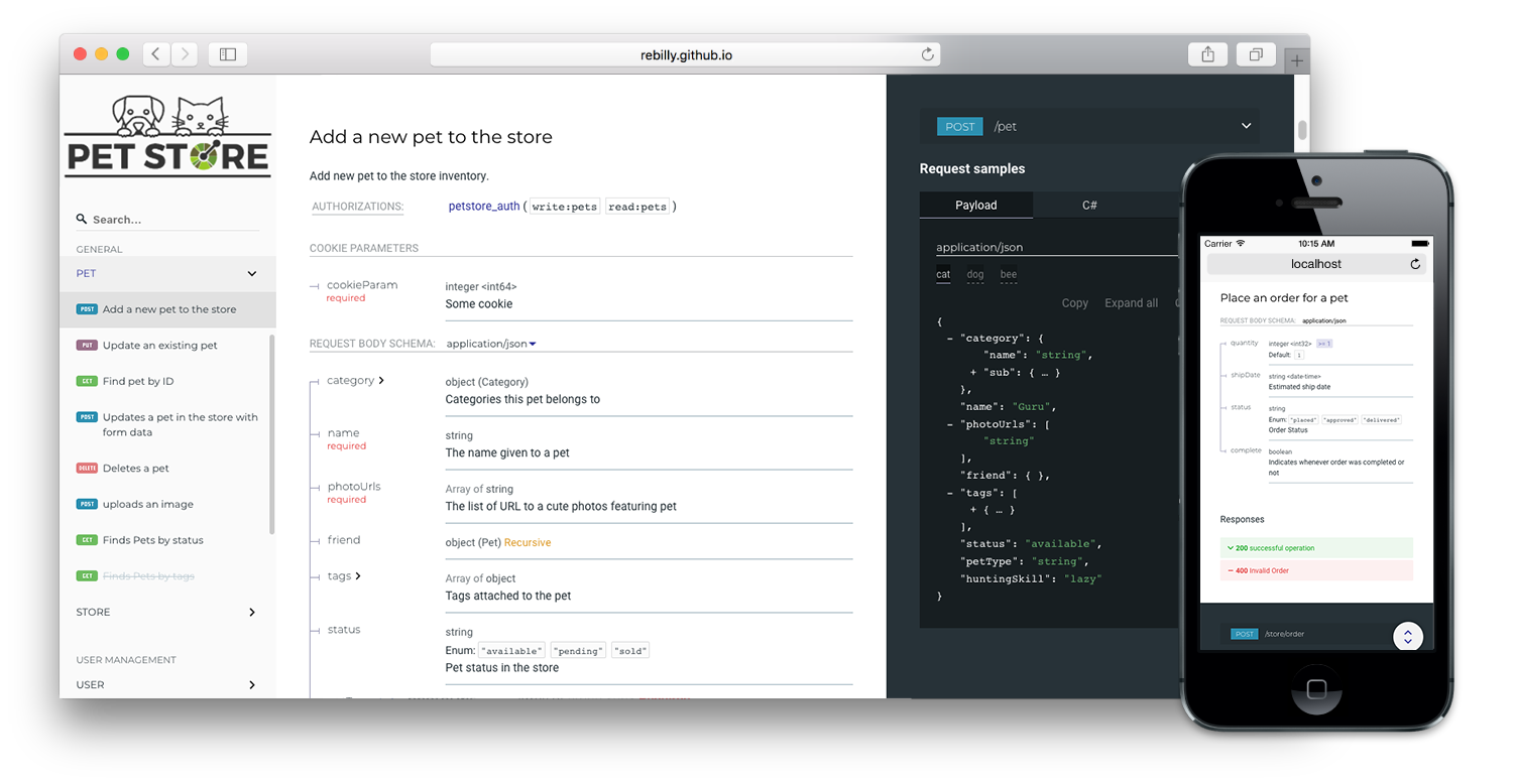
By default Redoc offers a three-panel, responsive layout:
- The left panel contains a search bar and navigation menu.
- The central panel contains the documentation.
- The right panel contains request and response examples.
Live demo
If you want to see how Redoc will render your OpenAPI definition, you can try it out online at https://redocly.github.io/redoc/.
A version of the Swagger Petstore API is displayed by default. To test it with your own OpenAPI definition, enter the URL for your definition and select TRY IT.
Redoc vs. Reference vs. Portals
Redoc is Redocly's community-edition product. Looking for something more? Checkout the following feature comparison of Redocly's premium products versus Redoc:
| Features | Redoc | Reference | Portals |
|---|---|---|---|
| Specs | |||
| Swagger 2.0 | √ | √ | √ |
| OpenAPI 3.0 | √ | √ | √ |
| OpenAPI 3.1 | √ (basic) | √ | √ |
| Theming | |||
| Fonts/colors | √ | √ | √ |
| Extra theme options | √ | √ | |
| Performance | |||
| Pagination | √ | √ | |
| Search (enhanced) | √ | √ | |
| Search (server-side) | √ | ||
| Multiple APIs | |||
| Multiple versions | √ | √ | |
| Multiple APIs | √ | ||
| API catalog | √ | ||
| Additional features | |||
| Try-it console | √ | √ | |
| Automated code samples | √ | √ | |
| Deep links | √ | √ | |
| More SEO control | √ | ||
| Contextual docs | √ | ||
| Landing pages | √ | ||
| React hooks for more control | √ | ||
| Personalization | √ | ||
| Analytics integrations | √ | ||
| Feedback | Coming Soon |
Refer to the Redocly's documentation for more information on these products:
Features
-
Responsive three-panel design with menu/scrolling synchronization
-
Ability to integrate your API introduction into the side menu
-
Command-line interface to bundle your docs into a zero-dependency HTML file
Customization options
- High-level grouping in side-menu with the
x-tagGroupsspecification extension - Branding/customizations using the
themeoption
Support
- OpenAPI v3.0 support
- Basic OpenAPI v3.1 support
- Broad OpenAPI v2.0 feature support (yes, it supports even
discriminator)

- Code samples support (via vendor extension)

Releases
Important: all the 2.x releases are deployed to npm and can be used with jsdeliver:
- particular release, for example,
v2.0.0-alpha.15: https://cdn.jsdelivr.net/npm/redoc@2.0.0-alpha.17/bundles/redoc.standalone.js nextrelease: https://cdn.jsdelivr.net/npm/redoc@next/bundles/redoc.standalone.js
Additionally, all the 1.x releases are hosted on our GitHub Pages-based CDN (deprecated):
- particular release, for example
v1.2.0: https://rebilly.github.io/ReDoc/releases/v1.2.0/redoc.min.js v1.x.xrelease: https://rebilly.github.io/ReDoc/releases/v1.x.x/redoc.min.jslatestrelease: https://rebilly.github.io/ReDoc/releases/latest/redoc.min.js - it will point to latest 1.x.x release since 2.x releases are not hosted on this CDN but on unpkg.
Version Guidance
| Redoc Release | OpenAPI Specification |
|---|---|
| 2.0.0-alpha.54 | 3.1, 3.0.x, 2.0 |
| 2.0.0-alpha.x | 3.0, 2.0 |
| 1.19.x | 2.0 |
| 1.18.x | 2.0 |
| 1.17.x | 2.0 |
Showcase
Lint OpenAPI definitions
Redocly's OpenAPI CLI is an open source command-line tool that you can use to lint your OpenAPI definition. Linting helps you to catch errors and inconsistencies in your OpenAPI definition before publishing.
Refer to Lint configuration in the OpenAPI documentation for more information.
Deployment
TL;DR final code example
To render your OpenAPI definition using Redoc, use the following HTML code sample and
replace the spec-url attribute with the url or local file address to your definition.
<!DOCTYPE html>
<html>
  <head>
    <title>Redoc</title>
    <!-- needed for adaptive design -->
    <meta charset="utf-8"/>
    <meta name="viewport" content="width=device-width, initial-scale=1">
    <link href="https://fonts.googleapis.com/css?family=Montserrat:300,400,700|Roboto:300,400,700" rel="stylesheet">

    <!--
    Redoc doesn't change outer page styles
    -->
    <style>
      body {
        margin: 0;
        padding: 0;
      }
    </style>
  </head>
  <body>
    <redoc spec-url='http://petstore.swagger.io/v2/swagger.json'></redoc>
    <script src="https://cdn.jsdelivr.net/npm/redoc@latest/bundles/redoc.standalone.js"> </script>
  </body>
</html>
For step-by-step instructions for how to get started using Redoc to render your OpenAPI definition, refer to the Redoc quickstart guide.
Redoc CLI
For more information on Redoc's commmand-line interface, refer to Using the Redoc CLI.
Configuration
Security Definition location
You can inject the Security Definitions widget into any place in your definition description.
For more information, refer to Security definitions injection.
OpenAPI specification extensions
Redoc uses the following specification extensions:
x-logo- is used to specify API logox-traitTag- useful for handling out common things like Pagination, Rate-Limits, etcx-codeSamples- specify operation code samplesx-examples- specify JSON example for requestsx-nullable- mark schema param as a nullablex-displayName- specify human-friendly names for the menu categoriesx-tagGroups- group tags by categories in the side menux-servers- ability to specify different servers for API (backported from OpenAPI 3.0)x-ignoredHeaderParameters- ability to specify header parameter names to ignorex-additionalPropertiesName- ability to supply a descriptive name for the additional property keysx-summary- For Response object, use as the response button text, with description rendered under the buttonx-extendedDiscriminator- In Schemas, uses this to solve name-clash issues with the standard discriminatorx-explicitMappingOnly- In Schemas, display a more descriptive property name in objects with additionalProperties when viewing the property list with an object
<redoc> options object
You can use all of the following options with the standalone version of the tag by kebab-casing them. For example, scrollYOffset becomes scroll-y-offset, and expandResponses becomes expand-responses.
disableSearch- disable search indexing and search box.expandDefaultServerVariables- enable expanding default server variables, defaultfalse.expandResponses- specify which responses to expand by default by response codes. Values should be passed as comma-separated list without spaces e.g.expandResponses="200,201". Special value"all"expands all responses by default. Be careful: this option can slow-down documentation rendering time.generatedPayloadSamplesMaxDepth- set the maximum render depth for JSON payload samples (responses and request body). The default value is10.maxDisplayedEnumValues- display only specified number of enum values. hide rest values under spoiler.hideDownloadButton- do not show "Download" spec button. THIS DOESN'T MAKE YOUR SPEC PRIVATE, it just hides the button.hideHostname- if set, the protocol and hostname is not shown in the operation definition.hideLoading- do not show loading animation. Useful for small docs.hideFab- do not show FAB in mobile view. Useful for implementing a custom floating action button.hideSchemaPattern- if set, the pattern is not shown in the schema.hideSingleRequestSampleTab- do not show the request sample tab for requests with only one sample.showObjectSchemaExamples- show object schema example in the properties, defaultfalse.expandSingleSchemaField- automatically expand single field in a schemaschemaExpansionLevel- specifies whether to automatically expand schemas. Special value"all"expands all levels. The default value is0.jsonSampleExpandLevel- set the default expand level for JSON payload samples (responses and request body). Special value"all"expands all levels. The default value is2.hideSchemaTitles- do not display schematitlenext to to the typesimpleOneOfTypeLabel- show only unique oneOf types in the label without titlessortEnumValuesAlphabetically- set to true, sorts all enum values in all schemas alphabeticallysortOperationsAlphabetically- set to true, sorts operations in the navigation sidebar and in the middle panel alphabeticallysortTagsAlphabetically- set to true, sorts tags in the navigation sidebar and in the middle panel alphabeticallylazyRendering- Not implemented yetif set, enables lazy rendering mode in ReDoc. This mode is useful for APIs with big number of operations (e.g. > 50). In this mode ReDoc shows initial screen ASAP and then renders the rest operations asynchronously while showing progress bar on the top. Check out the demo for the example.menuToggle- if true clicking second time on expanded menu item will collapse it, defaulttrue.nativeScrollbars- use native scrollbar for sidemenu instead of perfect-scroll (scrolling performance optimization for big specs).noAutoAuth- do not inject Authentication section automatically.onlyRequiredInSamples- shows only required fields in request samples.pathInMiddlePanel- show path link and HTTP verb in the middle panel instead of the right one.requiredPropsFirst- show required properties first ordered in the same order as inrequiredarray.scrollYOffset- If set, specifies a vertical scroll-offset. This is often useful when there are fixed positioned elements at the top of the page, such as navbars, headers etc;scrollYOffsetcan be specified in various ways:- number: A fixed number of pixels to be used as offset.
- selector: selector of the element to be used for specifying the offset. The distance from the top of the page to the element's bottom will be used as offset.
- function: A getter function. Must return a number representing the offset (in pixels).
showExtensions- show vendor extensions ("x-" fields). Extensions used by ReDoc are ignored. Can be boolean or an array ofstringwith names of extensions to display.sortPropsAlphabetically- sort properties alphabetically.payloadSampleIdx- if set, payload sample will be inserted at this index or last. Indexes start from 0.theme- ReDoc theme. For details check theme docs.untrustedSpec- if set, the spec is considered untrusted and all HTML/markdown is sanitized to prevent XSS. Disabled by default for performance reasons. Enable this option if you work with untrusted user data!sideNavStyle- can be specified in various ways:- summary-only: displays a summary in the sidebar navigation item. (default)
- path-only: displays a path in the sidebar navigation item.
- id-only: displays the operation id with a fallback to the path in the sidebar navigation item.
<redoc> theme object
spacingunit: 5 # main spacing unit used in autocomputed theme values latersectionHorizontal: 40 # Horizontal section padding. COMPUTED: spacing.unit * 8sectionVertical: 40 # Horizontal section padding. COMPUTED: spacing.unit * 8
breakpoints# breakpoints for switching three/two and mobile view layoutssmall: '50rem'medium: '85rem'large: '105rem'
colorstonalOffset: 0.3 # default tonal offset used in computations
typographyfontSize: '14px'lineHeight: '1.5em'fontWeightRegular: '400'fontWeightBold: '600'fontWeightLight: '300'fontFamily: 'Roboto, sans-serif'smoothing: 'antialiased'optimizeSpeed: trueheadingsfontFamily: 'Montserrat, sans-serif'fontWeight: '400'lineHeight: '1.6em'
code# inline code stylingfontSize: '13px'fontFamily: 'Courier, monospace'lineHeight: # COMPUTED: typography.lineHeightfontWeight: # COMPUTED: typography.fontWeightRegularcolor: '#e53935'backgroundColor: 'rgba(38, 50, 56, 0.05)'wrap: false # whether to break word for inline blocks (otherwise they can overflow)
linkscolor: # COMPUTED: colors.primary.mainvisited: # COMPUTED: typography.links.colorhover: # COMPUTED: lighten(0.2 typography.links.color)
menuwidth: '260px'backgroundColor: '#fafafa'textColor: '#333333'activeTextColor: # COMPUTED: theme.menu.textColor (if set by user) or theme.colors.primary.maingroupItems# Group headingstextTransform: 'uppercase'
level1Items# Level 1 items like tags or section 1st level itemstextTransform: 'none'
arrow# menu arrowsize: '1.5em'color: # COMPUTED: theme.menu.textColor
logomaxHeight: # COMPUTED: menu.widthmaxWidth: # COMPUTED: menu.widthgutter: '2px' # logo image padding
rightPanelbackgroundColor: '#263238'width: '40%'textColor: '#ffffff'
fabbackgroundColor: '#263238'color: '#ffffff'
Development
see CONTRIBUTING.md


