---
layout: home
title: Material Design for Bootstrap, the world's most popular mobile-first and responsive front-end framework.
---

<main class="bd-masthead" id="content" role="main">
  <div class="container">
    <span class="bd-booticon outline">MDB</span>
    <p class="lead">Material Design for Bootstrap, the world's most popular mobile-first and responsive front-end framework.</p>
    <p class="lead">
      <a href="{{ site.baseurl }}/getting-started/download" class="btn btn-outline-inverse btn-lg" onclick="ga('send', 'event', 'Jumbotron actions', 'Download', 'Download {{ site.data.version }}');">Download</a>
    </p>
    <p class="version">Currently v{{ site.data.version }}</p>
    {% include ads.html %}
  </div>
</main>

<div class="bd-featurette">
  <div class="container">
    <h2 class="bd-featurette-title">Easy to get started.</h2>
    <p class="lead">Quickly include Material Design for Bootstrap's CSS and JS into any project. Use your favorite package manager, download the source, or use the Material Design for Bootstrap CDN.</p>

    <div class="row">
      <div class="col-sm-6 m-b-lg">
        <h4>Managed dependencies</h4>
        <p>Include Material Design for Bootstrap's source Sass and JavaScript files via Bower, Composer, Meteor, or npm. Package managed installs don't include documentation, but do include our Gruntfile and readme.</p>
        <p>
          <a class="btn btn-bs btn-outline" href="{{ site.baseurl }}/getting-started/download/#package-managers">View install methods</a>
        </p>
      </div>
      <div class="col-sm-6 m-b-lg">
        <h4>Material Design for Bootstrap CDN</h4>
        <p>When you just need to include Material Design for Bootstrap's compiled CSS and JS, use the Material Design for Bootstrap CDN, free from the Max CDN folks.</p>
        <p>
          <a class="btn btn-bs btn-outline" href="{{ site.baseurl }}/getting-started/introduction">See Getting Started</a>
        </p>
      </div>
    </div>
  </div>
</div>

<div class="bd-featurette">
  <div class="container">
    <h2 class="bd-featurette-title">Designed for everyone, everywhere.</h2>
    <p class="lead">Material Design for Bootstrap makes front-end web development faster and easier. It's made for folks of all skill levels, devices of all shapes, and projects of all sizes.</p>

    <div class="row">
      <div class="col-sm-4 m-b-lg">
        <img src="assets/img/sass.png" alt="Sass support" class="img-fluid">
        <h4>Preprocessor</h4>
        <p>Material Design for Bootstrap ships with vanilla CSS, but its source code utilizes <a href="http://sass-lang.com/">Sass</a>, a popular CSS preprocessor. Quickly get started with precompiled CSS or build on the source.</p>
      </div>
      <div class="col-sm-4 m-b-lg">
        <img src="assets/img/devices.png" alt="Responsive across devices" class="img-fluid">
        <h4>One framework, every device.</h4>
        <p>
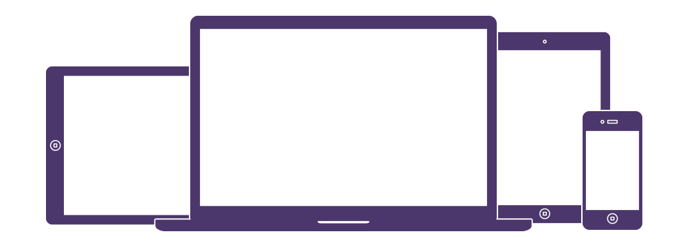
Material Design for Bootstrap easily and efficiently scales your websites and applications with a single code base, from phones to tablets to desktops with CSS media queries.</p>
      </div>
      <div class="col-sm-4 m-b-lg">
        <img src="assets/img/components.png" alt="Components" class="img-fluid">
        <h4>Full of features</h4>
        <p>With Material Design for Bootstrap, you get extensive and beautiful documentation for common HTML elements, dozens of custom HTML and CSS components, and awesome jQuery plugins.</p>
      </div>
    </div>

    <hr class="half-rule m-t-0">

    <p><strong>Material Design for Bootstrap is open source!</strong> It's hosted, developed, and maintained on GitHub by folks like you.</p>
    <a href="{{ site.repo }}" class="btn btn-bs btn-outline">View the GitHub project</a>
  </div>
</div>