| screenshots | ||
| .gitignore | ||
| .jshintrc | ||
| alerts.less | ||
| animations.less | ||
| buttons.less | ||
| checkboxes.less | ||
| index.html | ||
| inputs.less | ||
| LICENSE.md | ||
| material.css | ||
| material.js | ||
| material.less | ||
| mixins.less | ||
| navbar.less | ||
| progress.less | ||
| radios.less | ||
| README.md | ||
| ripple.less | ||
| shadows.less | ||
| tabs.less | ||
| variables.less | ||
Material Design for Bootstrap
This Bootstrap theme is an easy way to use the new Material Design guide-lines by Google in your Bootstrap 3 based application.
Just include the theme right after the Bootstrap CSS and include the javascript at the end of your document, everything will be converted to Material Design (paper) style.
This theme is in early developement and is not ready for production.
Check out the demo at this link.
Currently supported elements:
- Input fields (text, numeric, email, etc)
- Textarea
- Buttons (ripple effect working)
- Select
- Navbar
- Button groups
- Input groups
- Checkbox
- Radio
- Alerts
- Progress bars
- Jumbotron
- Wells
- Dialogs
Documentation
Material Design for Bootstrap provides some additional stuff to get the best from Material Design.
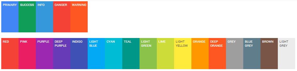
Variations:
There are 17 additional color variations (in addition to the classic 4 variations) for buttons, inputs, checkboxes, radios, alerts, navbars, tabs, labels, paginations, progess bars and more.
They can be used adding to the desired element the class suffix -material-color replacing color with the desired one.
Example:
<button class="btn btn-material-deeppurple">Deep purple button</button>
These colors are took from the Material Design color palette and are reported below:
Buttons:
Add .btn-flat to a button to make it flat, without shadows.
Add .btn-raised to a button to add a permanent shadow to it.
Inputs:
Add .floating-label to an input field with a placeholder to transform the placeholder in a floating label.
Remember to use the proper HTML markup to get radio and checkboxes styled correctly (choose between radio or checkbox):
<div class="radio/checkbox radio-primary">
    <label>
        <input type="radio/checkbox" checked>
        Option one is this
    </label>
</div>
Compatibility
Currently Material Design for Bootstrap supports Google Chrome (tested v37+), Mozilla Firefox (tested 30+), Internet Explorer (tested 11+). Mobile browsers are not currently tested but may works.